If you’re interested in creating a project like this, let us know!
Piecing together disparate data from various transit providers can be a hassle. Oftentimes just getting a clean picture of the existing transit network translates to hours of extra work.
UrbanFootprint eases this friction by giving planners and community stakeholders access to quick insights that can help lead to better planning outcomes. With transit-oriented development gaining momentum as a strategy for accommodating growth in a climate-sensitive manner, being able to map and evaluate existing transit alongside surrounding land use is more important than ever.
To streamline workflows for transit and land use planning, we’ve compiled and standardized transit data from thousands of operators, giving UrbanFootprint users access to up-to-date transit network data anywhere in the country. For example, the map below shows all transit operators on the eastern seaboard, with routes colored by the type of transit service.
The UrbanFootprint transit layers, routes, and stops are assembled based on transit data retained in the General Transit Feed Specification (GTFS) format and sourced from TransitLand, the largest transit data repository on the web. Our layers capture all published transit operators ranging from dense and complex transit systems in major corridors and regions to bus systems in small-to-medium-sized urban areas.
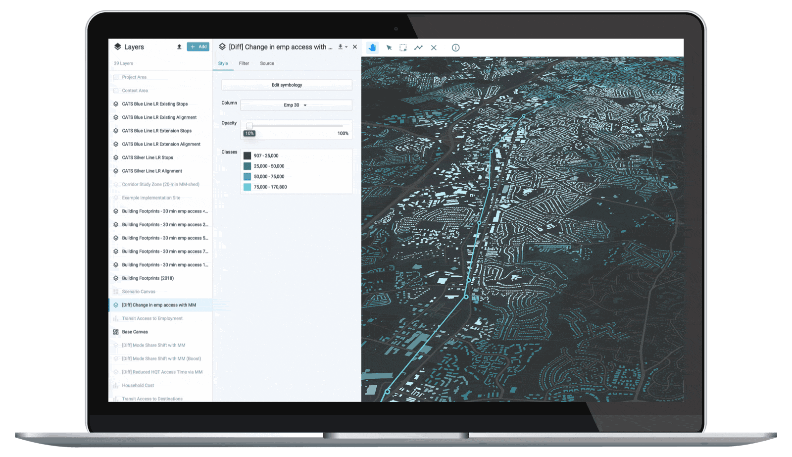
This rich database also serves as the input to the UrbanFootprint Transit Accessibility Module, which compiles transit schedule information from all operators to assess opportunities and deficiencies in terms of transit accessibility to amenities such as parks, schools, and hospitals, as well as to employment and households. With UrbanFootprint’s scenario building capabilities, users can also assess how future land use changes may impact transit accessibility.
The map below shows job accessibility in Des Moines, Iowa with the region’s existing transit network overlaid showing how buses expand access to opportunities to residents living along these corridors.
A true test of these datasets is the San Francisco Bay Area, with over two dozen transit operators and agencies providing services ranging from trains and buses to ferries. Given this fragmentation, trying to answer a simple question, such as how many people live within a quarter mile of transit stop, is usually a daunting task. With UrbanFootprint, you can map the Bay Area transit system without breaking a sweat!
In just a few minutes, we created the UrbanFootprint map below to show all transit operators in the Bay Area. With a robust data library at our fingertips, we can even layer on additional datasets to answer complex questions, such as those introduced by Senator Scott Weiner’s SB 50, which aimed to streamline housing around high quality transit areas across the state.
Interested in exploring transit networks in your community or planning project?
Book a demo with our team and learn how to set up your own analysis in minutes. We’ll share how to quickly explore existing conditions, map insights from thousands of preloaded datasets, build future scenarios, and analyze plan impacts on transit accessibility, emissions, energy use, and more.
Have a question or comment? Let us know! We’d love to hear from you. Tweet us your thoughts or send us a note.