If you’re interested in creating a project like this, let us know!
Maps are an essential medium for communicating important planning insights — from demographic trends to parks and job access and more. Today, we’re excited to introduce 3D data visualization in UrbanFootprint, a powerful tool for highlighting patterns and contrasts in spatial data. Let’s look at a few examples.
Mapping walk access to parks in San Diego
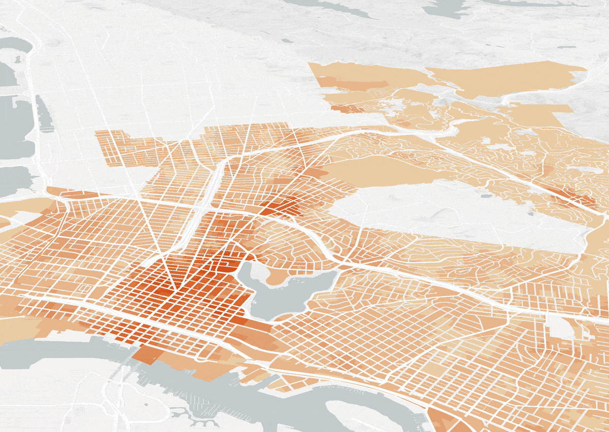
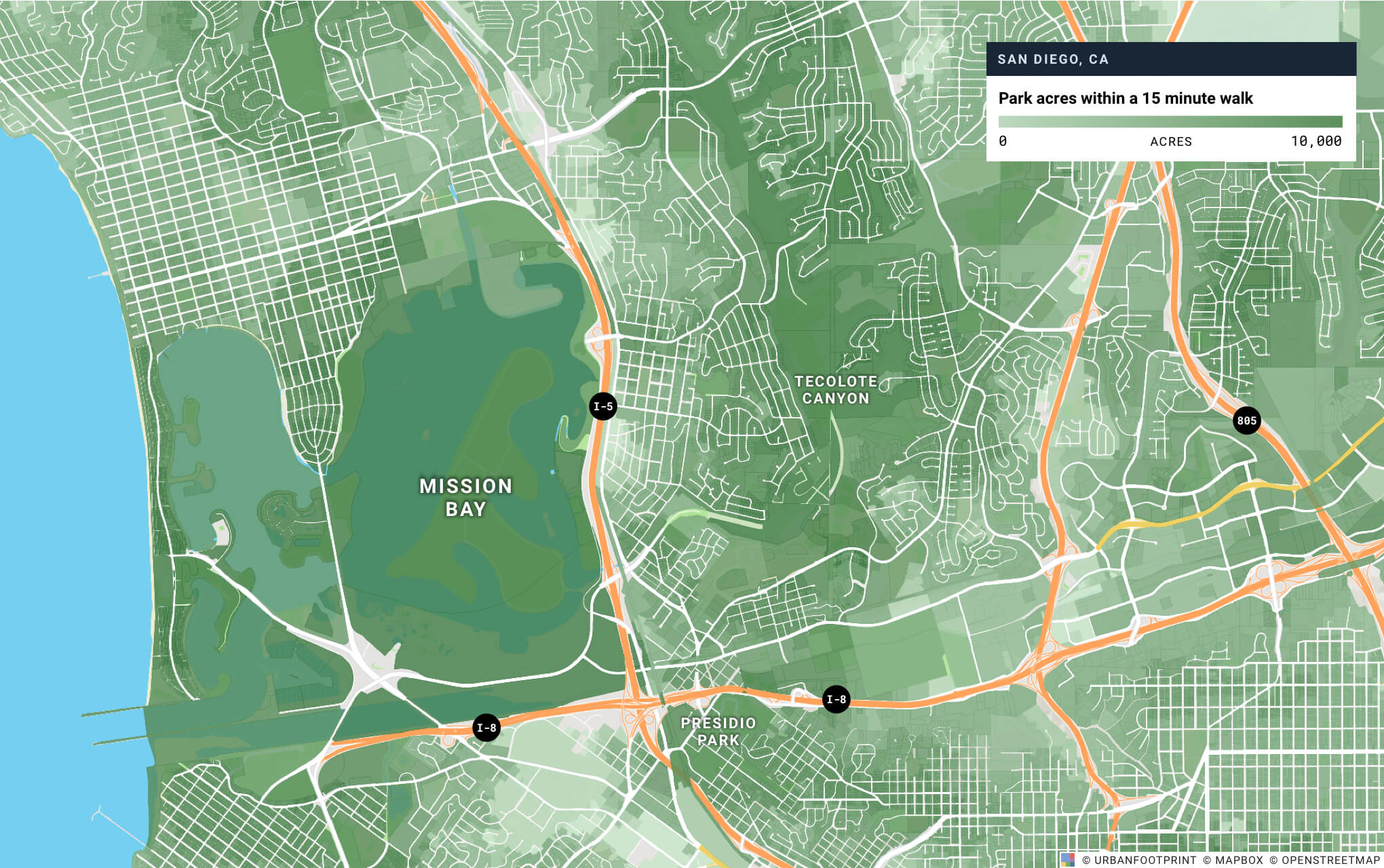
Say we want to visualize household walk access to parks in San Diego. In the 2D, choropleth map below, you can see patterns in households’ access to parks within a 15 minute walk. Darker shades of green indicate walk access to more park acres, while lighter shades of green indicate walk access to fewer park acres.
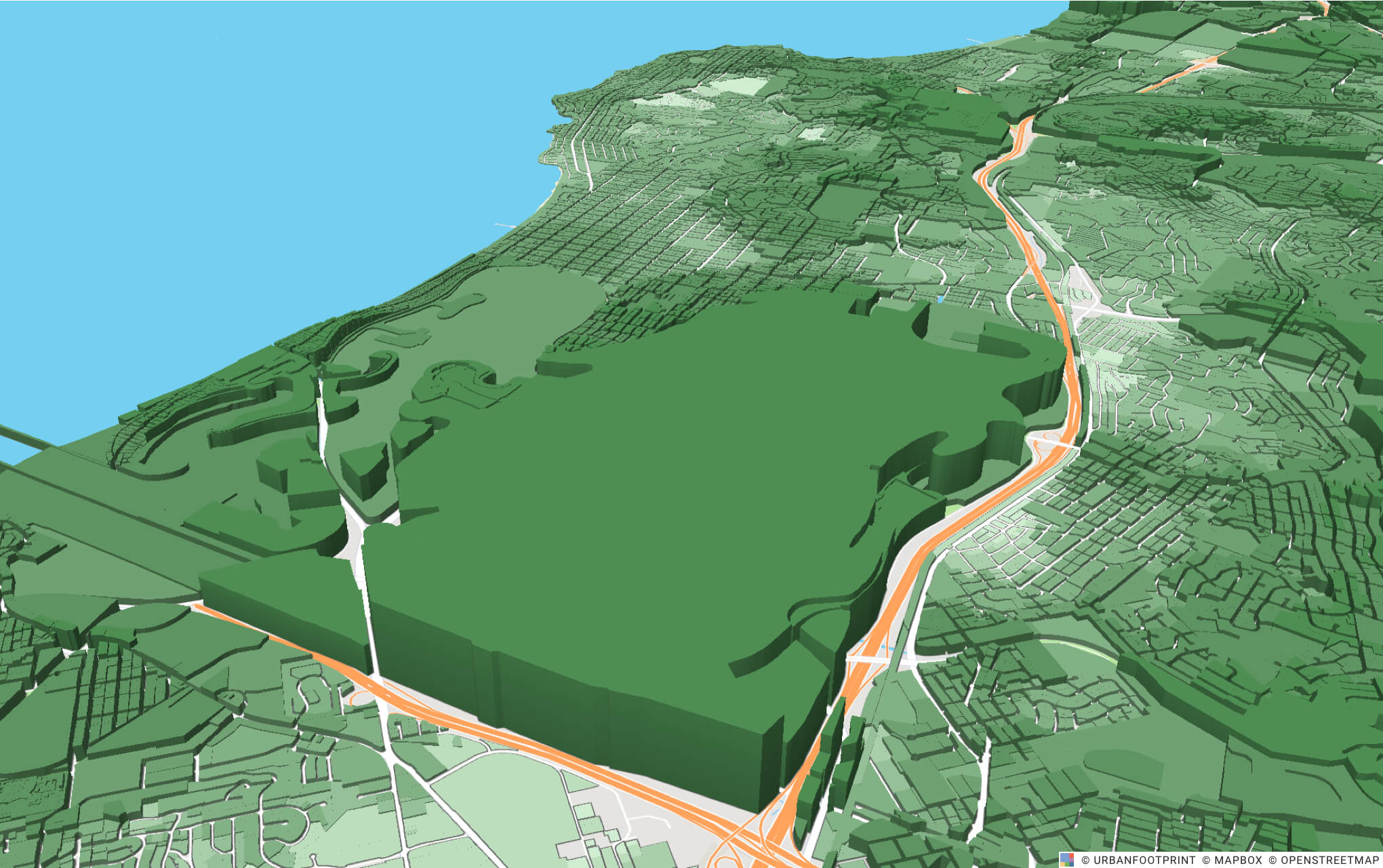
When we turn on 3D visualization for UrbanFootprint’s walk access to parks layer, we can easily see the contrast in access to San Diego’s large Mission Bay parks between the east and west sides of the I-5 freeway. If not for the freeway, residents of the adjacent neighborhoods would be able to walk to hundreds of acres of park land compared to the one to three acres they can currently walk to in 15 minutes.
Exploring employment and household density in Oakland
Let’s take a look at another example of 3D data visualization in UrbanFootprint. First, we mapped parcel-level employment density. We then turned on 3D data extrusion. The 3D map below lets you quickly identify where the major (and minor) employment nodes are in Oakland.
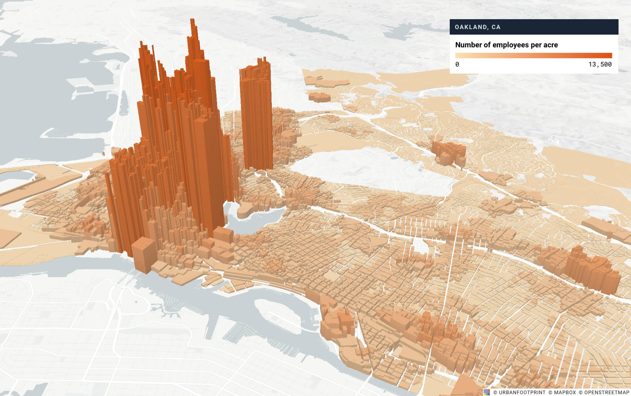
As you’d expect, downtown Oakland has the most jobs per acre, along with another high-density employment node to the north around the Temescal and Piedmont Avenue districts. This matches with a quick look at the breakdown of employment by type. Nearly half of all 163,000 jobs are office, which are concentrated downtown. In contrast, remaining retail, public, and industrial employees are more dispersed across the city. For example, the Port of Oakland to the west has over 3,000 jobs, but is flat when visualized in 3D because these jobs are spread across more land. The smaller nodes visible in districts like Fruitvale and Laurel are likely retail jobs.
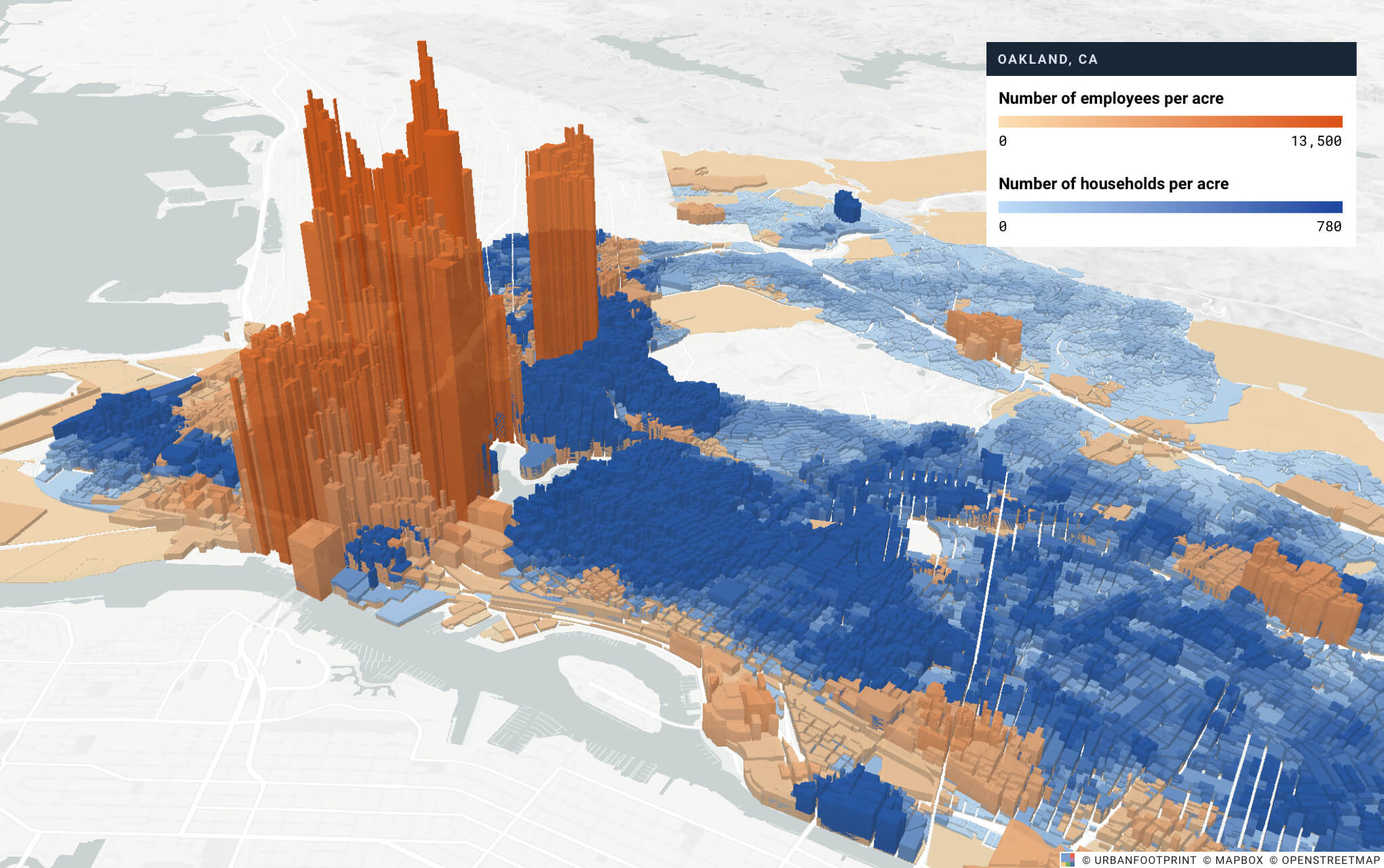
In the map below, we layered in household density to highlight patterns in residential versus employment locations. Nearly everything east of downtown is dominated by residential, with higher densities closer to downtown spreading out to predominantly low-density, single-family neighborhoods farther east.
Ready to get started? Learn three steps to make your own 3D map.
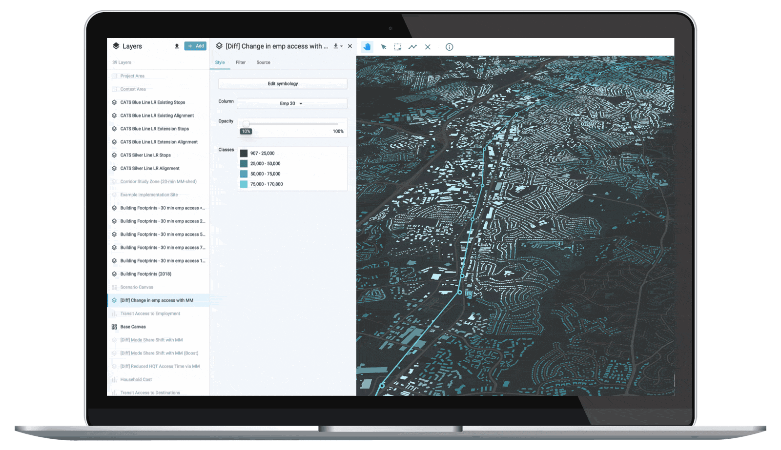
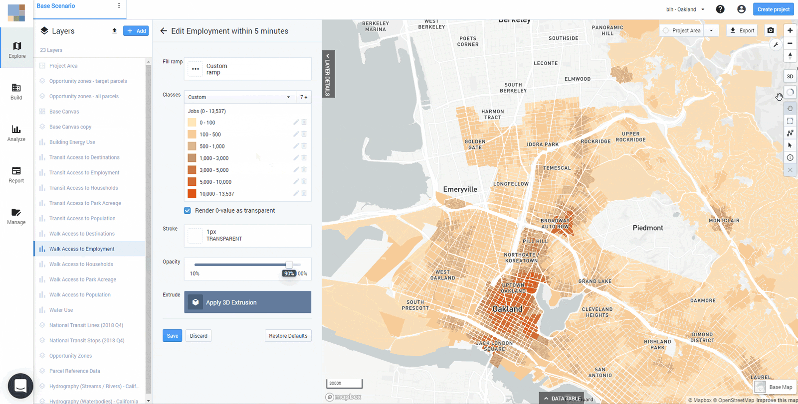
It’s easy to extrude data layers in UrbanFootprint:
1. Simply select any numeric column in a layer and click Edit Symbology.
2. Classify the data however you like and then click Apply 3D Extrusion.
3. Finally, play with the scale factor until you find the most legible setting.
Take your map insights to new heights.
Have a specific use case or example you’d like to review? Book a demo with our team. We’ll share how UrbanFootprint is designed to enhance and streamline your planning process.