If you’re interested in creating a project like this, let us know!
UrbanFootprint’s nationwide transit data just got a major upgrade. Beyond mapping the location of public transit lines and stops, UrbanFootprint users can now explore nationwide data on transit mode, operator, route length, and, most importantly, summarized performance characteristics such as frequency, run time, and speed.
We’ve made it easier than ever for planners, mobility analysts, and community stakeholders to ask critical questions that depend on a greater understanding of transit service quality, such as:
- What corridors have the best or worst transit service?
- What is the current land use pattern around metro stations?
- How many households are within a quarter-mile of bus stops with headways of 15 minutes or less?
- What does job density look like around major transit stops?
Answers to these essential planning questions are the foundation for neighborhood, corridor, and comprehensive plans. With our new, one-of-a-kind nationwide transit layers, you can quickly map, analyze, and understand existing transit network performance as well as its connections to where people live and work in your community or planning region. Combined with UrbanFootprint’s built-in workflows to query spatial data, users can even use this information to begin evaluating policy impacts such as finding eligible areas for streamlined development based on major transit stop locations under CEQA or assessing California SB 50’s impacts on land use.
Ready to learn more? In this blog, we’ll walk through a few example transit and land use questions and how to explore the data with UrbanFootprint.
First, here’s how to view nationwide transit data in UrbanFootprint.
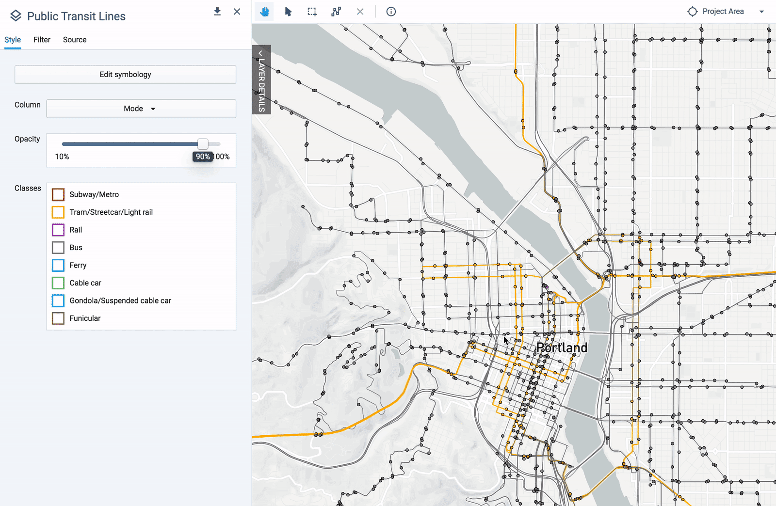
To get started, simply select the new layers, Public Transit Lines and Public Transit Stops, in UrbanFootprint’s layer manager and add them to your project.
By default, both layers display transit by mode (e.g. bus, subway). This allows you to quickly understand the transit networks for your project area and make existing transit maps in minutes.
Next, let’s dig into some important questions on transit performance.
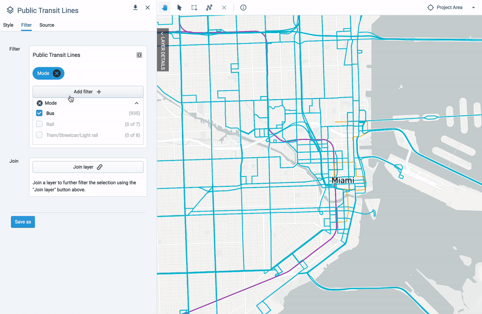
Which bus routes provide frequent service during the weekday commute?
The new Public Transit Lines layer contains a set of key transit service performance characteristics, summarized by route and time period. For example, you can easily identify bus routes that have five or more hourly arrivals on average during the weekday AM peak. Check out the simple filter query used below.
Which transit routes offer the most service on a typical weekday?
You can map any of the service attributes to visually understand the service patterns in your project area. For example, the map below shows total arrivals throughout a typical weekday. The darker the line’s color, the greater the level of service that is offered throughout the day.
Which is the existing land use pattern for parcels within a half-mile of transit?
In addition to visualizing transit routes, you can also identify parcels of interest based on transit service characteristics. For example, you may want to look at land use patterns near transit routes that have more frequent services.
In the example below, we selected transit routes that have average headways of less than 10 minutes on a typical weekday during the AM peak. We then created a half-mile buffer around the routes. Using the buffer, we identified all the parcels along these routes and summarized their land use characteristics.
What percent of the population is currently within a quarter-mile of a transit stop? How many jobs are accessible within a quarter-mile of transit stop?
Just like with the layer Public Transit Lines, you can use Public Transit Stops to better understand station area characteristics. In the example below, we created quarter-mile buffers around stops with a 10-minute or less headway during both the AM and PM peaks.
Using the quarter-mile buffers above, we quickly summarized population, households, and jobs adjacent to the selected transit stops (using the Data Table shown below).
UrbanFootprint’s upgraded nationwide transit data gives planners and community stakeholders the information they need to understand existing conditions and the foundation to develop scenarios for improved transit performance. With easy access to ready-to-map transit data, planners can spend less time curating data and instead dedicate more resources to analysis, community engagement, and critical decision-making processes.
Ready to give the new transit layers a try?
Book a demo with our team to see the data in action. Discover how planners, advocates, and analysts are using UrbanFootprint to map, measure, and analyze transit performance nationwide.