


If you’re interested in creating a project like this, let us know!
Accessibility to transit is an essential factor in building thriving communities. In practice, getting the data we need to effectively measure existing transit accessibility – let alone planning for future improvements – is typically an expensive and time-consuming process.
UrbanFootprint streamlines this process to democratize access to advanced mapping and data analysis tools. From evaluating local transit and bike share networks to the impact of dockless bike and scooter deployments, UrbanFootprint makes it easy to distill actionable insights from thousands of preloaded datasets for any U.S. location.
In the first installment of our new blog series, Planning for Equitable Access to New Mobility, we’ll share how to quickly evaluate existing transit accessibility down to the parcel scale and identify areas that are underserved by the current transit network.
Evaluate transit accessibility nationwide
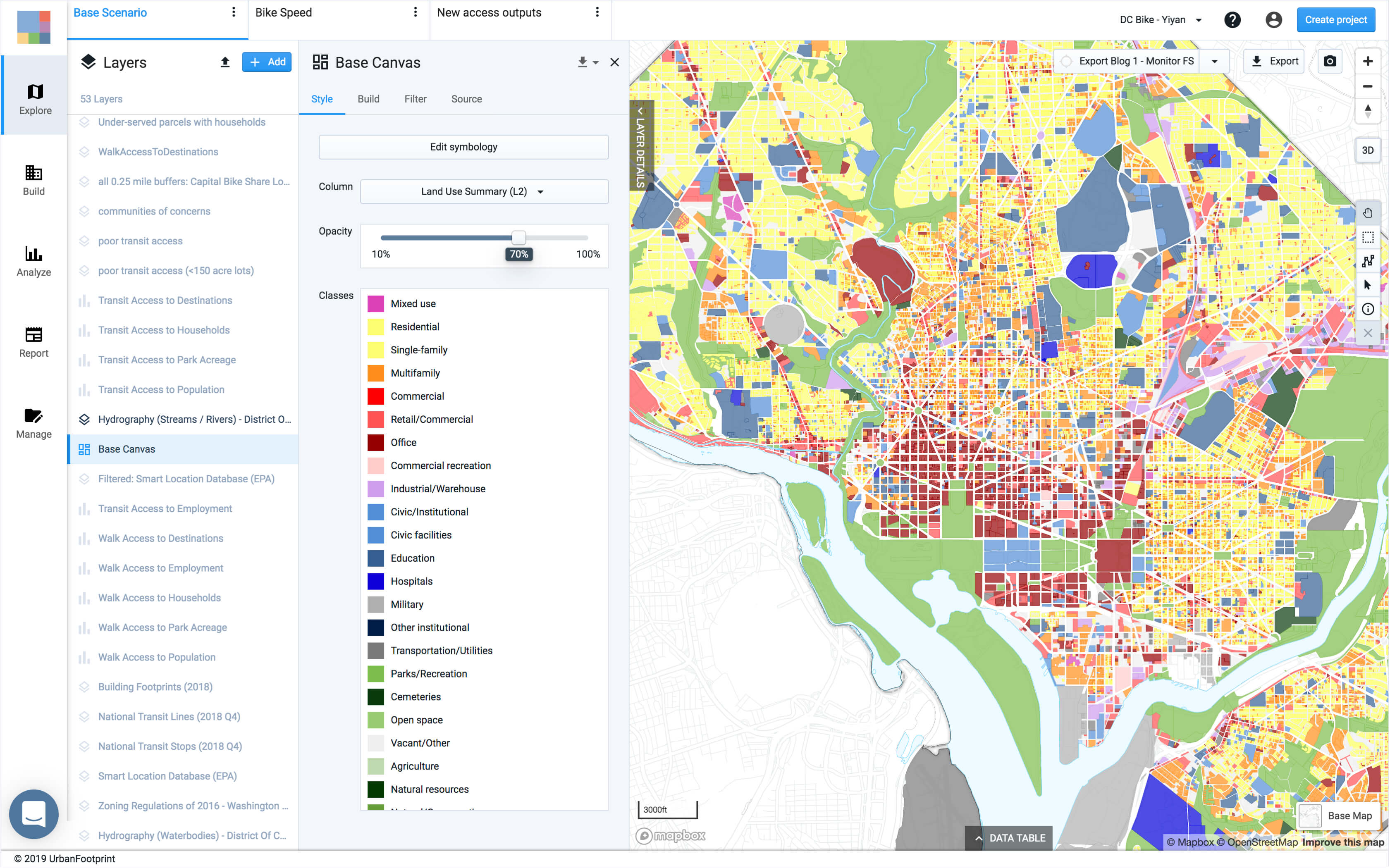
UrbanFootprint contains dozens of standardized attributes for nearly all locations in the U.S. To create an UrbanFootprint project, simply type the name of the city, county, or region you’d like to explore. In minutes, UrbanFootprint will generate a parcel-level, land use map and find all additional datasets relevant to map for your location, from transit routes and stops, to socio-demographic and building footprint data, and more.
Among the many preloaded transit and mobility datasets available in UrbanFootprint is the EPA Smart Location dataset. This dataset is used by many planners and mobility analysts and includes a variety of statistics about transit service and access to jobs by transit.
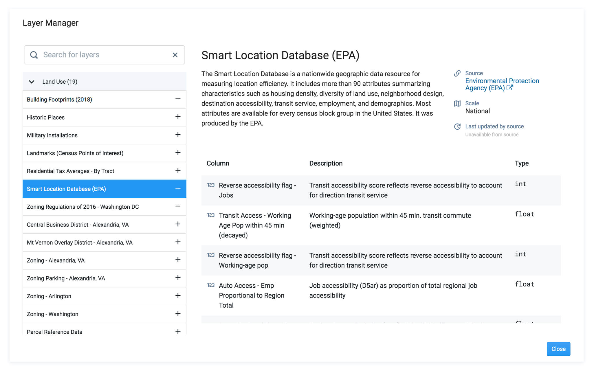
While this dataset may be sufficient for large-scale transit analyses, like national or regional studies, the dataset is relatively coarse when evaluating transit accessibility for a single city as it’s based on Census Block Groups. Census block groups are geographic areas which tend to be large (they may include entire neighborhoods) and are designed to represent areas encompassing roughly 600 to 3,000 people.
Use finer-grained location intelligence to identify transit-poor areas
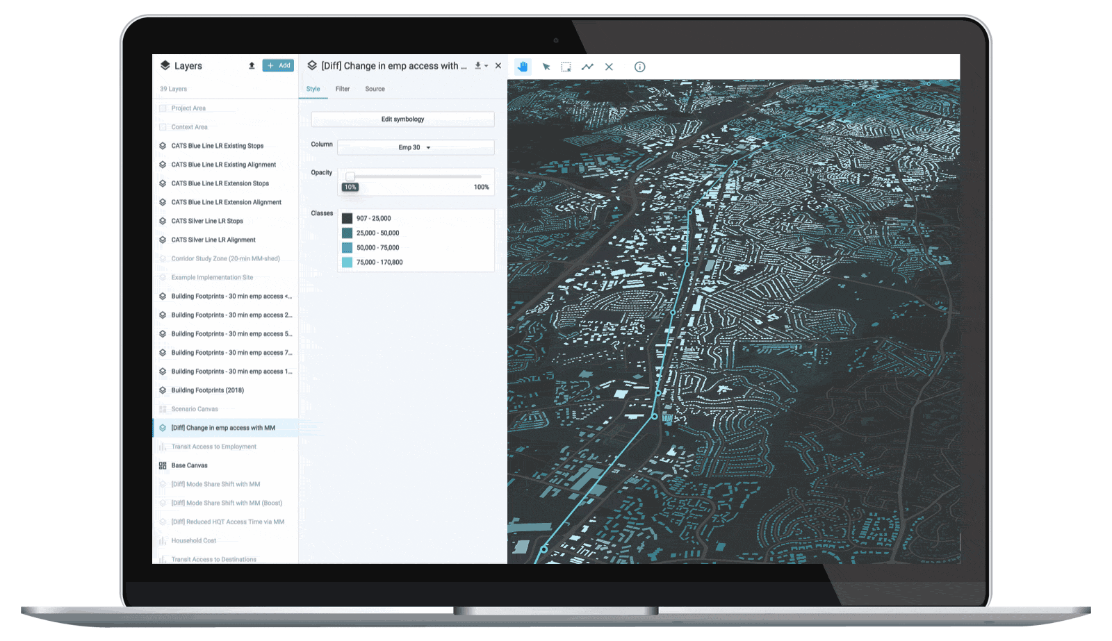
With UrbanFootprint’s built-in Transit Accessibility Module we can take transit accessibility insights one step further as results are generated at the individual parcel scale, detailing current land use and occupation attributes for each.
This added level of granularity makes it easier to accurately assess current transit conditions and pinpoint areas with poor access to transit. To illustrate this advantage, we can examine the EPA’s 45-minute transit access to jobs metric and evaluate the same metric as reported with UrbanFootprint.1
With UrbanFootprint’s built-in Walk and Transit Accessibility Analysis Modules, we can calculate high resolution transit access figures by identifying all parcels that are both far from high-quality transit stations2 (places that are more than a 10-minute walk from a station) and have relatively low transit access to jobs (places that are in the bottom 30th percentile of access to regional jobs within 30 minutes). Let’s describe areas that fall under both these constraints as “transit-poor.”
Both of these outputs can be generated in UrbanFootprint with the push of a button. By combining the two outputs above, users can produce a more detailed analysis of transit-poor areas (shown below).

Because UrbanFootprint knows how many households and how many people reside in each parcel, we can calculate the portion of the population that resides in these transit-poor areas with a greater degree of accuracy, which in our example of Washington D.C., exceeds 40% (40.6%).
The resulting exhibit provides highly accurate visibility into where transit-poor conditions occur. As results are mapped, we can explore each area in detail, providing insight that can be leveraged by:
- Transit operators seeking to realign and tweak bus routes to fill in previously unseen gaps.
- New mobility companies seeking to identify where micro-mobility deployments, such as the JUMP bike utilization analysis in this Uber blog post, could be most effective.
- Regulators and policy officials seeking to create targeted, equity-focused programs around retrofitting transit-poor locations with new micro-mobility services.
Ready to build your own walk and transit accessibility analyses?
Book a demo and learn how UrbanFootprint can help you better understand mobility performance in your community or project. Stay tuned for more installments of our Planning for Equitable Access to New Mobility series where we’ll take a closer look at equitable access to new mobility options in Washington, D.C.
Have a question? We’d love to hear from you. Drop us a line or tweet us @UFplatform.
Footnotes
- 1.The EPA dataset applied a decay function to jobs as they increase in distance from a Canvas Block Group. UrbanFootprint’s Transit Accessibility Module uses a decay factor as well. The raw transit accessibility results show all jobs accessible within the given time constraint and leverage. UrbanFootprint’s national parcel canvas to maintain accuracy.
- 2.High-quality transit stations include types of fixed-route transit with frequent services, such as rail, subway, metro, and light rail.